
Designathons
AI-forward, curiosity-first, perpetually building, heliophile
moving fast, cares about the why, ergophilia, storyteller

hi! I'm Diya, I study design at Stanford, and I build the things I design.
Experience
- product design @ carta
- 2026product design @ commvault
- 2026design volunteer @ develop for good
- 2026design strategy and research @ crimson
- 2025product design @ wisdomQ
- 2025design and research @ nasdaq ec
- 2025product design @ cred ai
"i'm a lifelong creative"
- 2024 exploring UX/UI, figma, graphic design
- 2020–2024 painting on canvas in oils and acrylics, building 3D installations
- 2020 tried every medium ever: watercolor, acrylics, oils, felt tips, soft pastels, charcoal
- 2017–2019 made miniature dollhouse rooms with foam, paper, and anything I could find
- 2014 made my first origami swan, made my first flipbook
Design stack
Tech stack
I have an Asian passport, a Gulf childhood, and a California zip code.
I learned to paint before I learned to prototype, and the same creative instinct carries both.

slide to enter combination to view case study
I redesigned the console homepage 4,000+ enterprise admins open first each day, cutting six sub-pages to one screen.
- Enterprise UX
- Stakeholder interviews
- Competitive audit
- Information architecture
- Design principles
- Design system
- Wireframing
- Hi-fi prototyping
- Usability testing
- Cross-functional collaboration
Enterprise software that keeps organizations' data safe, recoverable, and compliant.
I took on the Command Center homepage, the screen backup and security admins open first every day to answer one question: is our data actually protected? It was the most-visited screen in the console and the least designed, inherited from a decade of features each adding its own widget.
Nobody owned it, so I scoped the problem myself and brought it to the UX team: if every widget carries equal weight, nothing is urgent, and an admin has to reconstruct their own risk picture on every visit. I argued for a personalized, action-oriented homepage that reads like a status briefing rather than a control panel.
That meant synthesising research across admin personas, defining who this homepage is genuinely for, the operator on shift, not the executive skimming quarterly, and writing the design principles the rest of the console redesign now builds on.
Solution
The problem: the homepage showed fourteen widgets of equal weight, and none of them answered whether anything was wrong. Admins were opening an average of six sub-pages before they could tell, and in usability sessions not one could name the console's single most urgent alert inside thirty seconds.
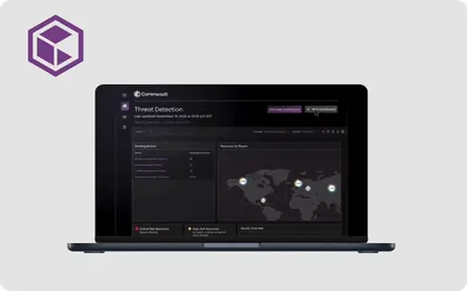
The console dashboard I designed as a Product Design Intern at Commvault, rebuilt so threat detection reads at a glance instead of demanding a tour.

Needs Attention leads with six cards: 5 Failed Jobs, 2 Pending Configurations, 4 Pending Permissions, a Threat Scan flagging malware in one resource, and two more slots for whatever else needs a look.
Recently Visited defaults to the active tab, showing the four things this admin actually touched last, Configure file server, test-connect, a replication group, Command Center, with Starred one click away.
A thin pink gradient banner marks the top of the page, and each section carries its own 3D illustration, the warning triangle, the locked cloud, so severity reads before anyone reads a word.
Recommended Services closes the page with five real integrations, SharePoint, Dynamics 365, Exchange, Microsoft 365, Salesforce, and a "See All" link instead of a long list.
Context matters
Before any screens changed, I ran a UX audit, synthesizing raw research into something the rest of the redesign could actually build on. Between the interviews and the eventual screens sits a layer of synthesis work that doesn't show up in a portfolio unless someone goes looking for it, so this is that layer.
The first pass was thematic synthesis: clustering raw interview quotes into affinity groups until a pattern actually held, rather than forcing one early. What mattered surfaced slowly, admins didn't want more information on the homepage, they wanted the right information surfaced without having to go looking for it.

From there, I checked those patterns against a competitive UX audit of how Veeam, Cohesity, Rubrik, and others handle the same problem, where their homepages default to status walls, and where they've started moving toward action-oriented framing instead. That comparison is where this redesign's actual point of view came from, and it's what the design principles in the next section are built on.


Wireframes
Low-fidelity, five concept directions for the failed-jobs / status system, before any of it had a visual language. Shown as-is, with the original annotations.
Concept 1, three status tiles double as navigation: border weight signals severity (heaviest = failed, lightest = healthy), and each tile links straight to its filtered job list. No raw numbers, the border does the work.

Concept 2, the three tiles compress into a single proportion bar: one bar, three clickable segments, showing the ratio of failed to at-risk to healthy in one glance instead of three separate reads.
Concept 3, the most critical job opens automatically on page load, error detail visible immediately with no click required.


Concept 4, setup becomes the hero, with a progress bar and three-state checklist rows.
Concept 5, designed for the no-failures state, where the status tiles disappear and recents become primary.


Mid-fidelity, Flow 1, a returning user who started setup but hasn't finished. Primary job: orient them around what's left. Secondary: surface any failed jobs.
Full 6-step checklist as the dominant element, failed jobs listed below
Checklist condensed to a progress banner with a "steps done" summary and inline actions
Two-column split, setup on the left, failed jobs and recently visited on the right
The current setup step surfaced as its own card, full checklist collapsed above it
Setup persists as a right-hand rail while the main content mirrors the fully-onboarded homepage
Setup card paired with service tiles, connecting the active step to what it unlocks
Setup progress as a horizontal step-timeline instead of a vertical checklist
Mid-fidelity, Flow 3, a fully onboarded user. Need: get them where they're going as fast as possible. Failed jobs surface only if they exist; the homepage is a navigation hub.
The standard view, failed jobs first, then recents, then service tiles
Recents promoted to the hero position as three large cards
Services grouped by category, Protect, Secure, as the primary content
Starred pages given hero treatment as a personalized tile grid
Failed jobs collapse to a single thin status banner when nothing needs attention
Failed jobs restated as a compact worklist with a status dot per row
A secondary pass on the same worklist-with-status-dot pattern
A hard two-column split, navigation isolated on the left, status entirely on the right
A large search bar as the first thing on the page, above everything else
Search elevated further, a full-width input with suggested chips, an AI-native pattern
Three equal-weight stacked sections, no single hero, dense and scannable
All rows, no cards or tiles, maximum information density, minimum visual noise
High-fidelity
The visual language went through its own iteration, separate from the layout decisions above, every explored version, from the earliest structural pass through to the final direction.


Final design
Needs Attention leads with six cards: 5 Failed Jobs, 2 Pending Configurations, 4 Pending Permissions, a Threat Scan flagging malware in one resource, and two more slots for whatever else needs a look.
Recently Visited defaults to the active tab, showing the four things this admin actually touched last, Configure file server, test-connect, a replication group, Command Center, with Starred one click away.
A thin pink gradient banner marks the top of the page, and each section carries its own 3D illustration, the warning triangle, the locked cloud, so severity reads before anyone reads a word.
Recommended Services closes the page with five real integrations, SharePoint, Dynamics 365, Exchange, Microsoft 365, Salesforce, and a "See All" link instead of a long list.

slide to enter combination to view case study
I shipped saved courses to Stanford’s official planning platform, taking a four-step save down to a single click for 17,000+ students.
- Product thinking
- User flows
- Interaction design
- Design system adoption
- Edge-case mapping
- Hi-fi prototyping
- Handoff to engineering
- A/B reasoning
Stanford's official course planner.
Every student uses it to browse, save, and build their quarterly schedule.

Students had one flat, unsorted list to dump every course they were even remotely curious about, with no way to organize by subject, requirement, or "why did I even save this."
No organization
Everything lands in one unsorted list, regardless of subject, requirement, or intent.
No context
No way to know why a course was saved in the first place, a requirement? a backup? just curious?
I redesigned course saving so students can keep a course in a single click, then sort what they save into their own custom, colour-coded lists, without ever forcing a decision at the moment of saving.
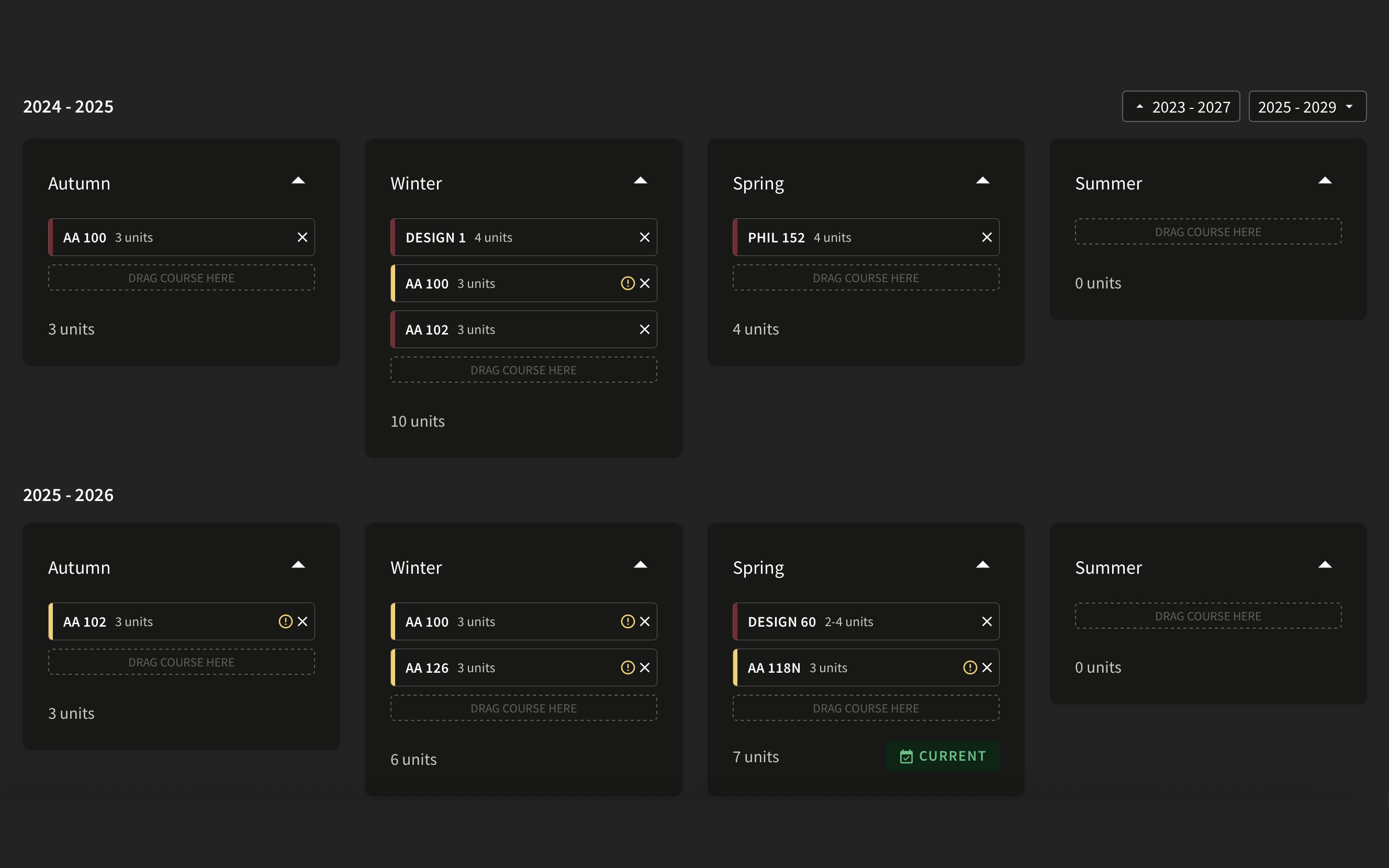
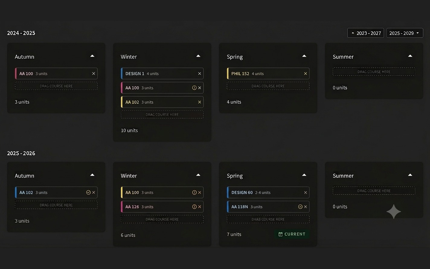
Color context, aware planner.
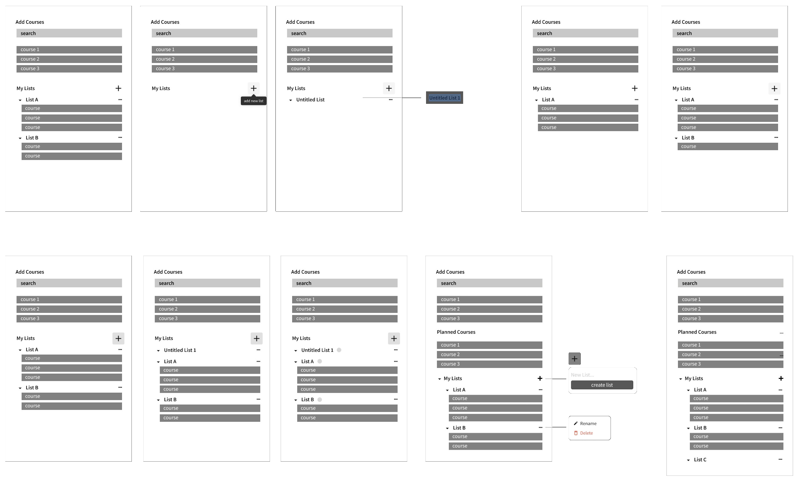
I started on paper, sketching interface and interaction flows for the lists feature, working through naming, drag-to-reorder, and how nested lists inside "My Lists" should behave before touching a screen.
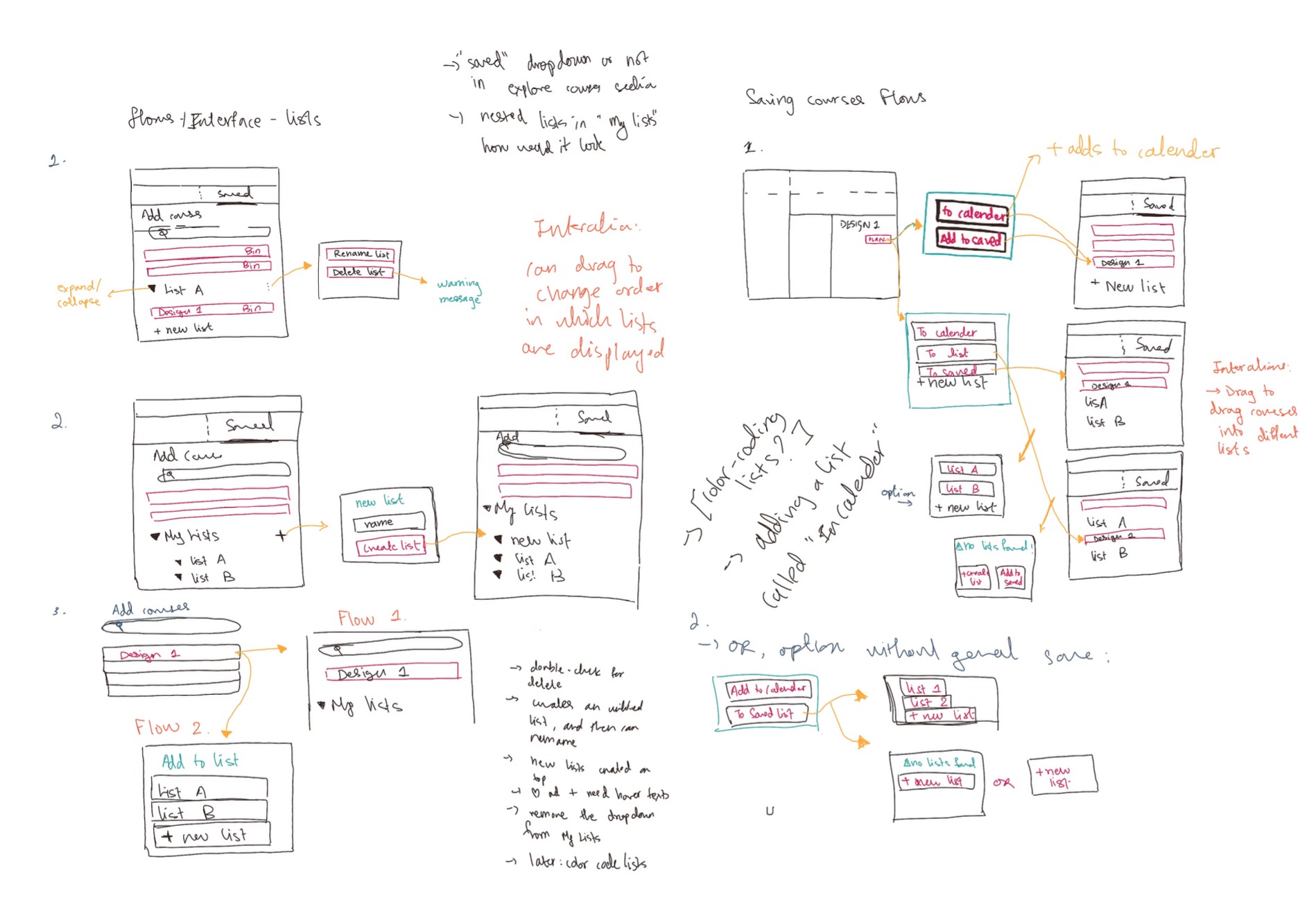
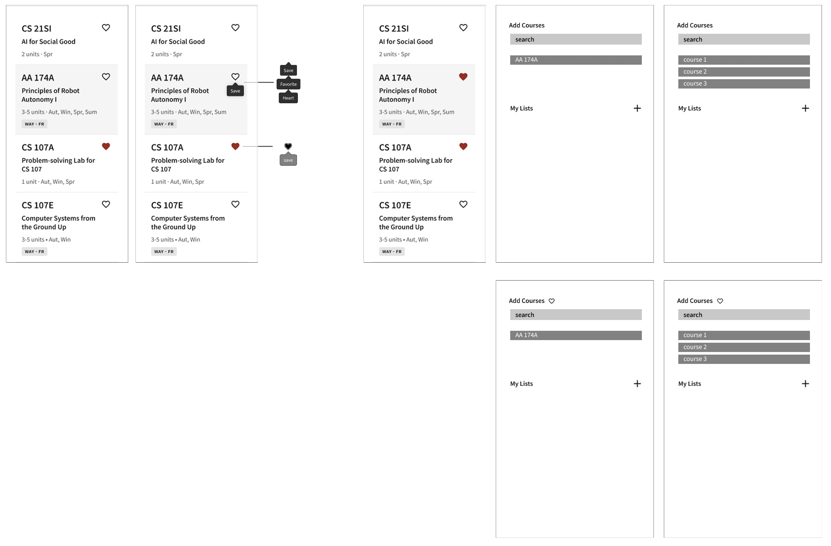
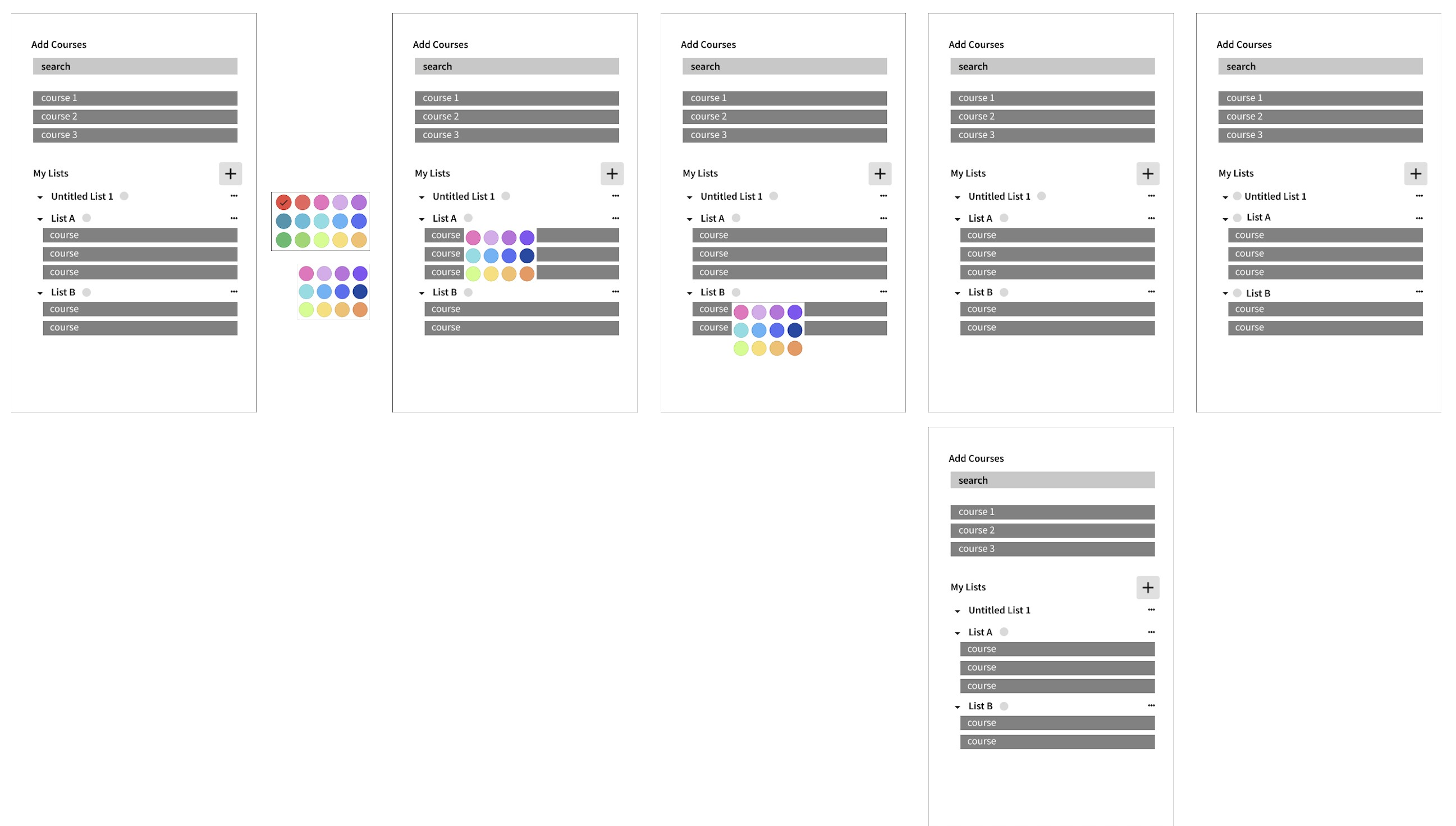
Saving courses, creating and naming lists, and color-coding them, each tested as its own flow before being merged into one cohesive interaction.
Flow 1, Creating saved lists and adding courses
Flow 2, Saving courses
Flow 3, Color-coding lists
After feedback from the team, I built out high-fidelity prototypes that stayed within Carta's existing design system, maximized visibility of key elements, minimized clutter, and surfaced discoverability.


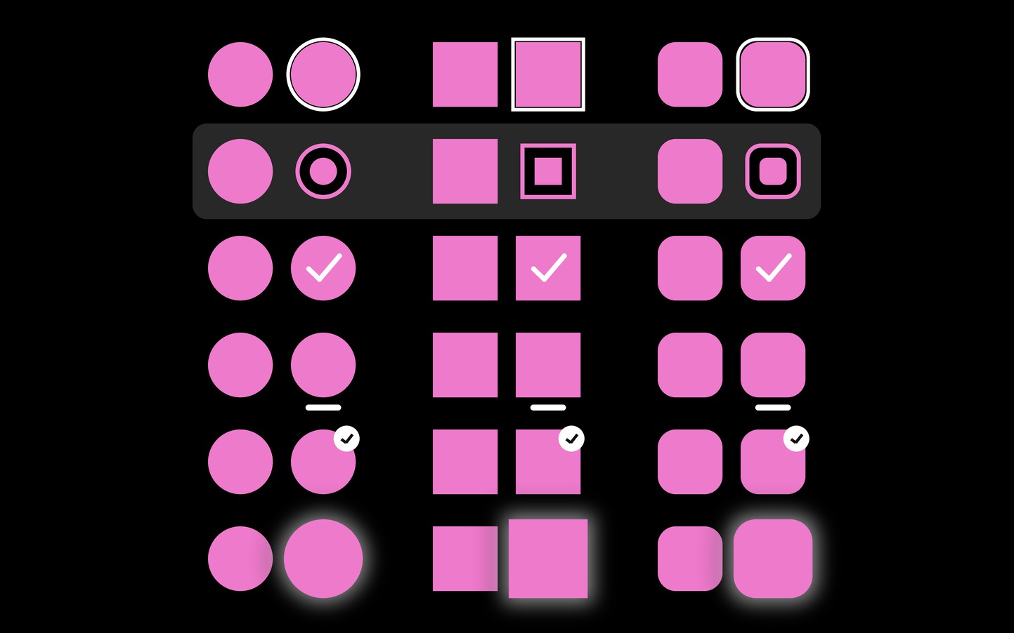
I used Carta's standard design system throughout, existing colors, type, icons, and components, rather than introducing anything new.


Ayles – AI Shopping Assistant
I built an iMessage shopping extension that reads chat context live to surface recommendations, finalist at the Phia Designathon.
- Rapid prototyping
- Concept ideation
- AI-assisted design
- Conversational UI
- Interaction design
- Visual design
- Design sprint
Ayles is a shopping feature I designed for the Phia Designathon. The brief: make users smarter shoppers, take a frustrating shopping moment and redesign it into something faster, smarter, and more enjoyable, focused on helping people find what they love without wasting time.
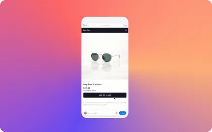
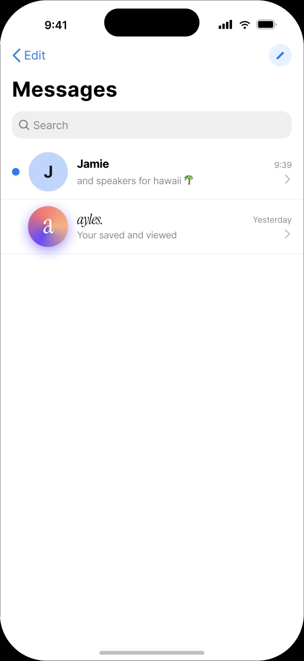
We don't type the way we talk, and shopping filters never quite capture what we mean, so instead of building another app, I designed something that fits into a conversation you're already having. As you discuss budget, vibe, color, and brand, Ayles surfaces options, syncs a shared feed with friends, and lets you save and buy without ever leaving the chat.
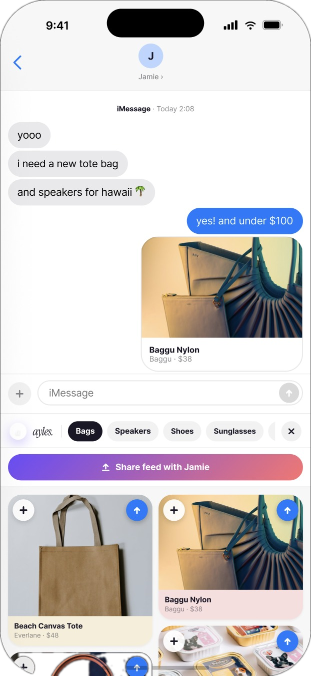
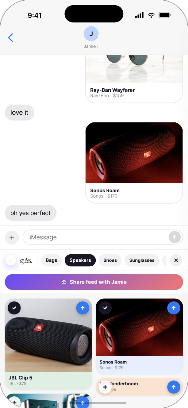
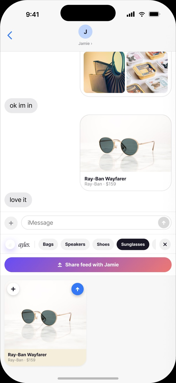
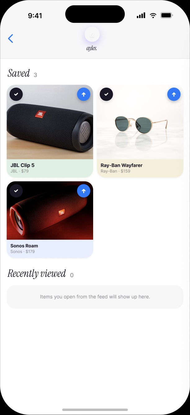
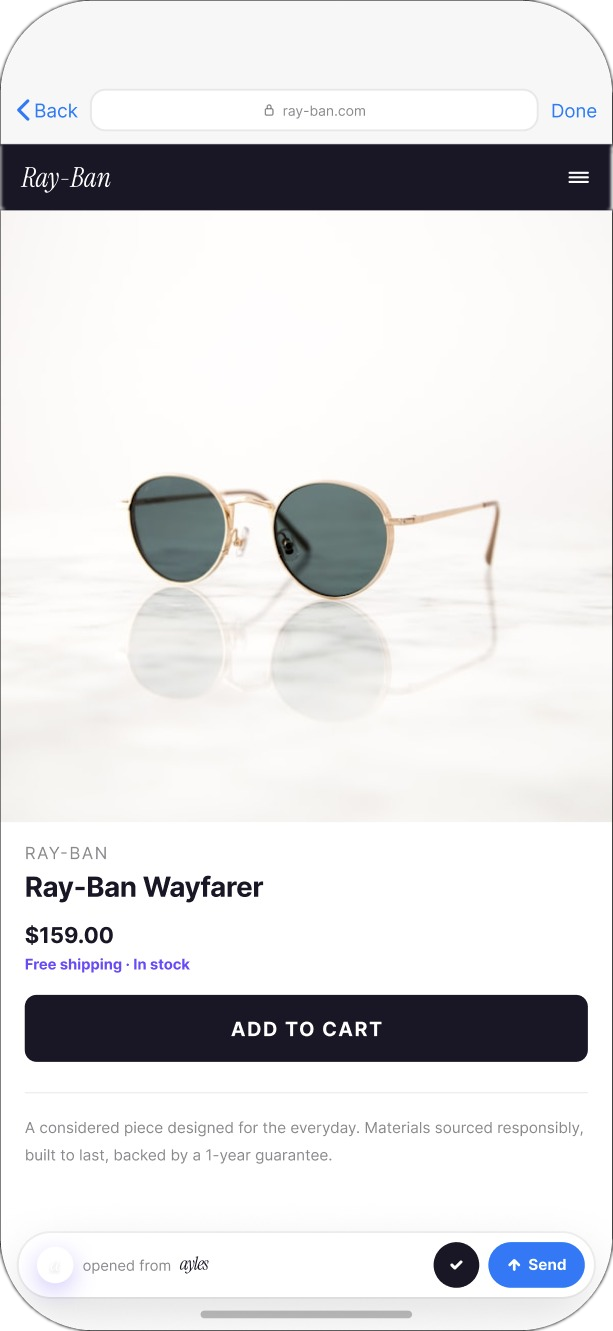
Products expand fully within iMessage, see and compare prices without ever leaving the chat. Next step: integrating checkout directly here too.
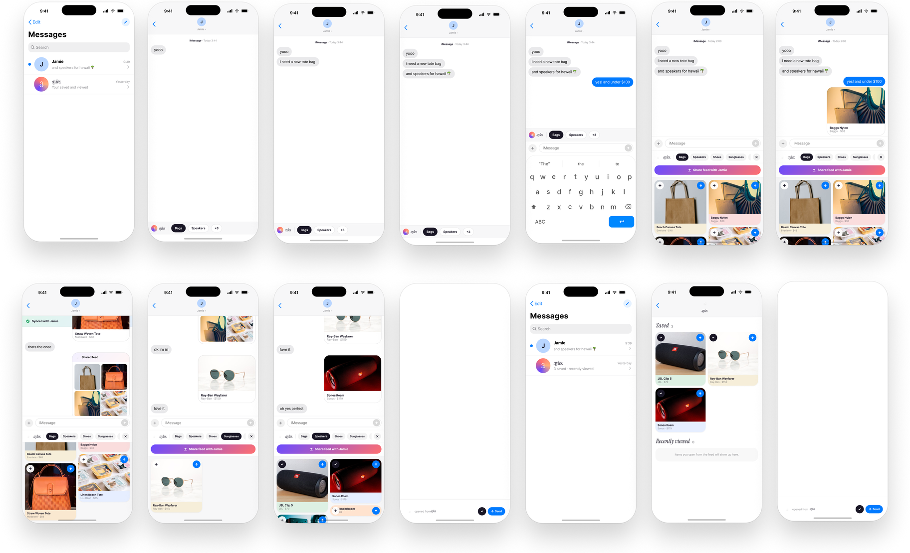
Tools used, Figma, Figma Make, Claude Code, Claude Design
OnCall – Legal Health Platform
I designed and shipped On Call from the ground up, connecting 300+ immigrant founders with free legal help.
- User research
- In-depth interviews
- Persona development
- Journey mapping
- Problem reframing
- Service design
- Information architecture
- Wireframing
- Hi-fi prototyping
- Usability testing
- Stakeholder alignment
Immigrant founders face disproportionate legal friction while starting and scaling, often without the financial means or the contextual knowledge to reach reliable legal help before a small problem becomes an expensive one.
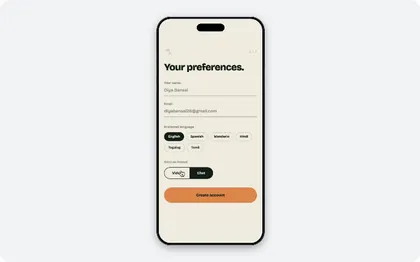
Every existing service treated legal help as a directory problem, find a lawyer, then figure out the rest yourself. My research said the barrier was never the list; it was the moment of asking. So I designed On Call around a single continuous thread instead: sign-up, booking, the live session and the follow-up all hold the same context, so a founder never has to explain their situation twice or judge whether a question is worth someone's time.
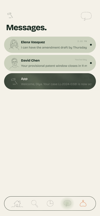
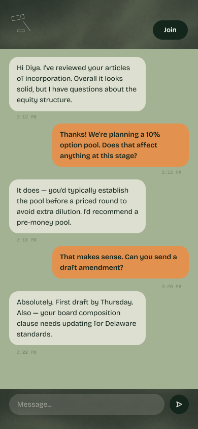
Splash to sign-up to preferences, in one continuous pass.
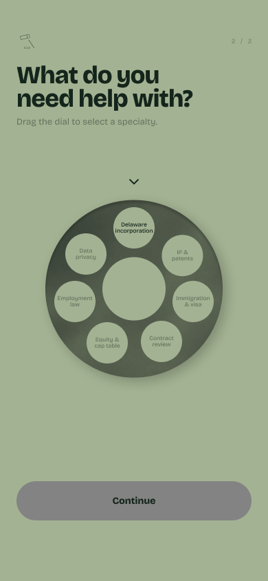
Specialty picked on a dial, not a dropdown.
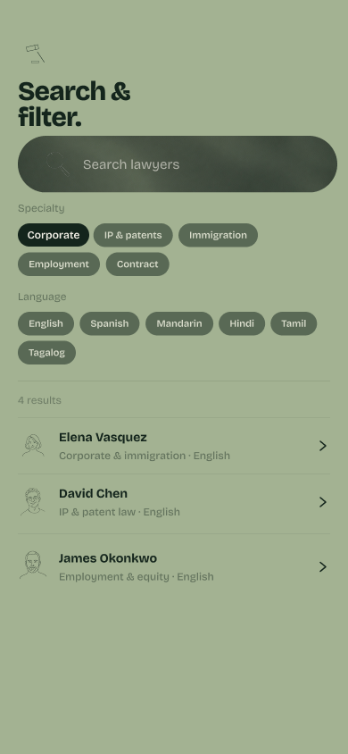
Or filter it down by specialty and language.
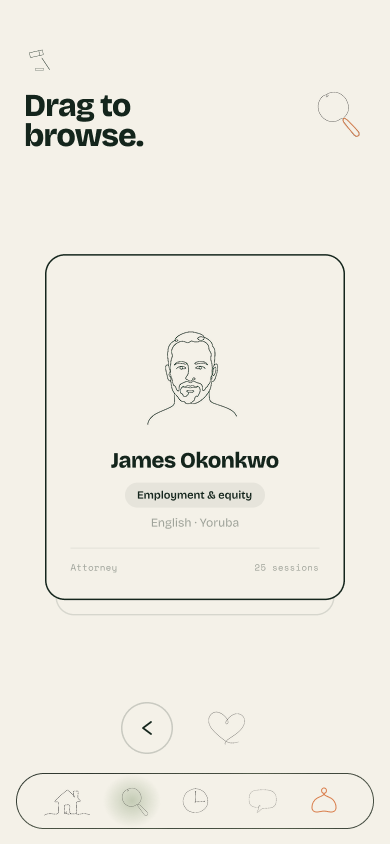
Each lawyer is a card, not a search result.
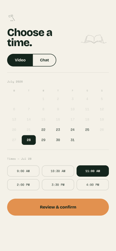
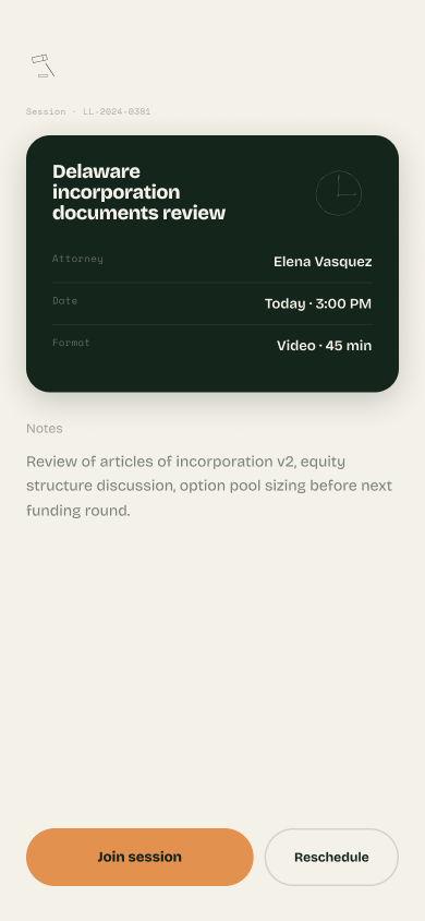
Date, time and format in a single view.
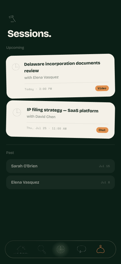
Cards you handle, not pages you navigate.
Date and time, picked in two taps.
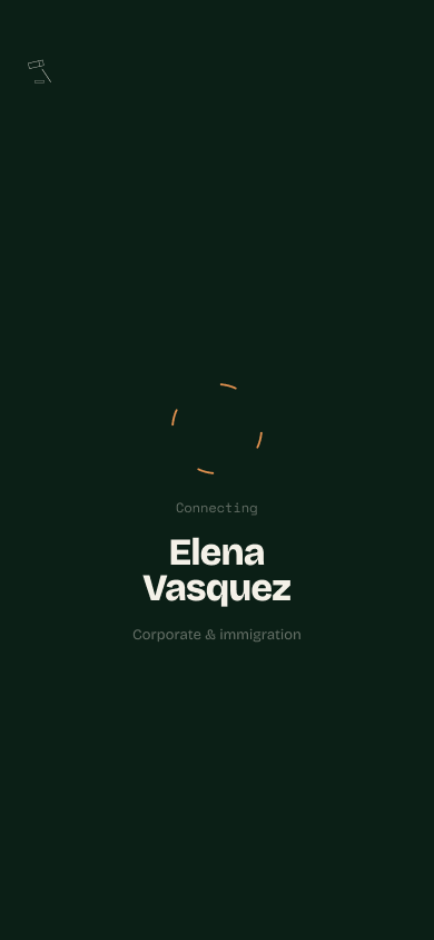
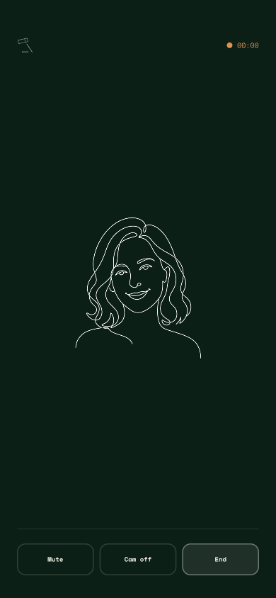
Call, feedback, and back to the dashboard, one flow.
A physical signature reads as a real commitment in a way a button tap doesn't.
Blur and checkmark close the loop, no separate confirm screen.
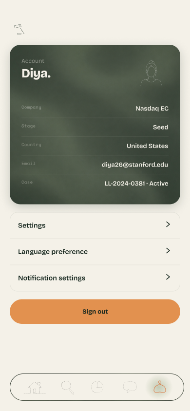
Everything booked lives here, the return point after every other flow, settings included.

Unfamiliar systems
Founders were navigating U.S. legal and startup norms with no prior context for how any of it worked.
Low trust in unfamiliar lawyers
No clear way to evaluate a lawyer's credibility, relevance, or intent before committing to them.
Time-sensitive, high-stakes decisions
Incorporation, contracts, and compliance issues carried long-term consequences and little room to guess.
Cost as a first barrier
Traditional legal services were priced far outside what an early-stage, self-funded founder could justify.
Rather than designing for "all founders," I scoped the user group early, low-income immigrant founders within the Center's own ecosystem, to go deep on a high-need population instead of shallow across a broad one.
I ran in-depth interviews with immigrant founders to understand where legal issues first appear in the founder journey, how they currently seek help, and why existing solutions fail them.

Deji is an experienced founder building a tech company in the U.S. While confident in his skills, he often faces uncertainty navigating legal systems and trust barriers in a new ecosystem. He values clear guidance, credibility, and timely support as he builds in an unfamiliar environment.
Goals
- To access trustworthy, affordable legal guidance early
- To establish credibility with investors and partners
Pain points
- Difficulty knowing which lawyers or legal services to trust
- Legal processes are expensive, opaque, and high-risk if done incorrectly
- Lacks immediate access to community or peers with similar immigrant experiences

*blurred for confidentiality

*blurred for confidentiality
Emotional highs and lows. Journey mapping surfaced that mood dropped hardest around unfamiliar processes and unresolved uncertainty, not around the legal issues themselves.
Incorporation feels like real progress, early momentum and optimism.
Hits a contract or compliance snag, with no clear sense of who to trust for help.
Outside legal help feels out of reach, unfamiliar terms, unclear cost.
Connects with a lawyer who explains the issue in plain terms.
Issue resolved, confidence to handle the next legal question alone.

This reframed the problem statement: low-income immigrant founders don't lack legal resources, they lack trusted, timely, low-friction access to legal guidance at the moment it matters most.
From that reframed problem statement, I generated a wide set of directional questions before narrowing toward a solution.
Before jumping into a digital solution, I designed three interactive, game-based prototypes to test assumptions around trust, observe how founders evaluate legal credibility, and understand decision-making under uncertainty.
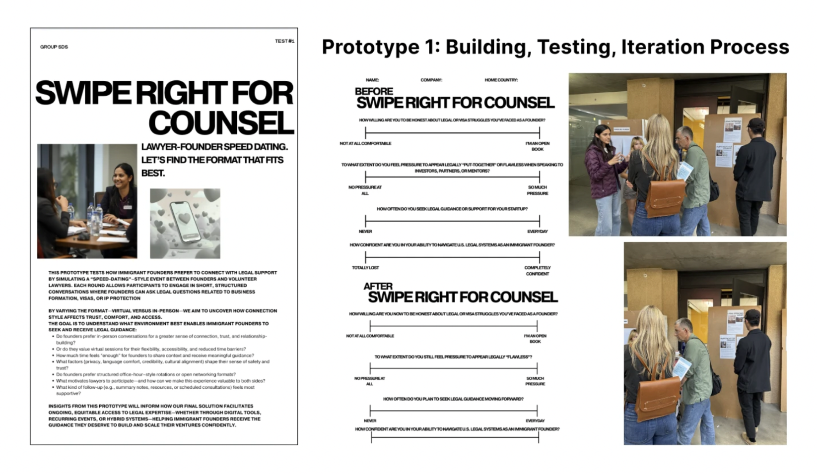
Swipe Right for Counsel, a speed-dating format between founders and volunteer lawyers
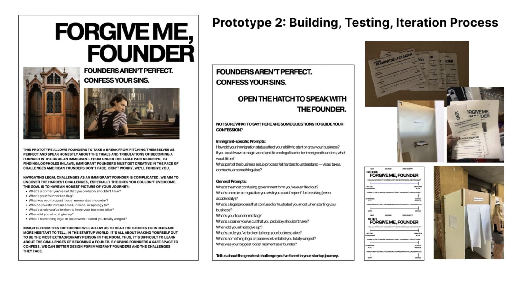
Forgive Me, Founder, a confession-booth format for founders to admit legal missteps without judgment
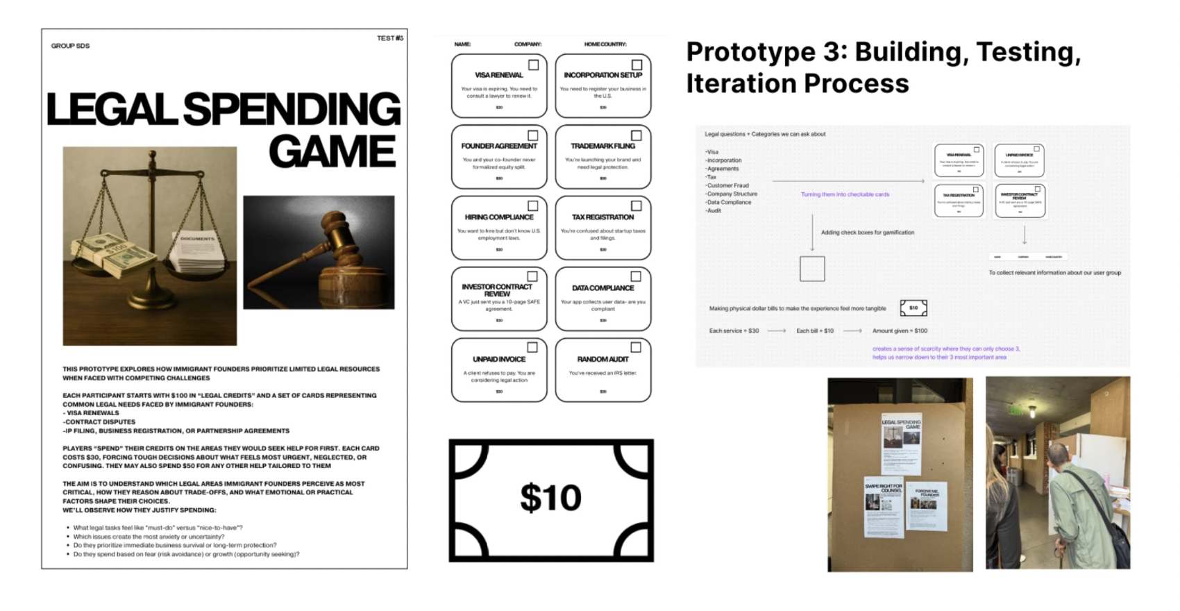
Legal Spending Game, founders allocate a fixed "legal credit" budget across competing priorities
Throughout the project, I worked closely with the Nasdaq Entrepreneurial Center to validate feasibility within their ecosystem, align with founder and business needs, and confirm the solution could realistically be supported and implemented. The final concept was formally presented to the Center, grounding every design decision in both user research and organizational constraints.
North – On-chain risk intelligence

I designed and built North end to end, 22 working screens, a full design system and a running prototype, written by me in the browser.
- Product strategy
- 0-to-1 design
- Design engineering
- Motion design
- Design system
- Component architecture
- Front-end build
- Interaction prototyping
- Data visualisation
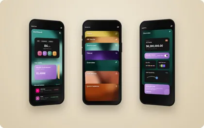
North watches the DeFi vaults you hold and tells you when one of them turns risky. It scores every position, flags what changed, and hands you the mitigation before the loss.
I have been trading on-chain since my first year at Stanford, and the part that never got easier was knowing when to worry. Every protocol reports its own numbers in its own format, so checking whether a position had drifted meant opening four dashboards and doing the comparison in my head. Risk was always available and never legible. The gap I kept running into is that nothing tells you a position has changed until the change has already cost you something.
North is a DeFi risk monitor I designed and built end to end, twenty-two screens, running in the browser.
Interact to explore further.
Colour carries meaning here. The palette is built on perceptual lightness, so each section owns a hue for identity while severity travels along lightness and chroma, a critical flag still reads as urgent in greyscale, and every tone holds its contrast against both the near-black and the cream the app moves between.
Every section owns one ramp. The stops are spaced on lightness, not on even hue steps, because the eye reads lightness far more reliably than saturation, which means a card stays legible whether it is sitting on black, behind a blur, or shrunk to a thumbnail in the deck. The darkest two stops exist only as backing for text; the brightest two only ever appear as accents, never as fills, so nothing on screen can vibrate.
Each card is a seeded field of five blurred blobs, so it looks organic and still renders identically every time, which matters because the deck animation carries a card between screens, and the card you tapped has to be the card that arrives. A fractal-noise grain at 45% overlay keeps the large soft gradients from banding.
Twenty-six asset marks
Each token keeps its own brand colour. Assets are the one thing someone recognises faster from the outside world than from anything the interface could teach them, so a tidier screen was not worth the recognition it would cost. Inline SVG on a 32px grid, sharp at any size.
Severity, in three tones
Stable, moderate and critical are the only status colours in the system, and they sit outside the section hues, because status has to survive being placed on top of any card and so must read on lightness contrast alone. Critical never uses pure red; it sits at a slightly warmer angle so it stays distinguishable from the coral section ramp underneath it.
The app moves between a near-black and a cream. Dark carries the monitoring screens, where the data is dense and the coloured cards need somewhere quiet to sit. Light carries the handful of screens that ask you to commit to something, connecting a wallet, confirming holdings, where a brighter ground slows the read down. Every ramp was checked against both.
I redesigned the International Center for Youth Justice’s internal dashboard around accessibility-first principles.
I'm volunteering with Develop for Good this summer, which matches skilled students with nonprofits that need product and design support.
My partner nonprofit, the Center for Improving Youth Justice (CIYJ), helps youth facilities and reentry programs adopt research-based practices that improve outcomes for young people and their families.
My focus: modernizing the dense, incrementally-built admin screens their small engineering team relies on, without touching the underlying workflows, starting with the global navigation that ties account management, facility configuration, and assessment tools together for the 1,000+ staff using it across 110+ programs.
- Nonprofit UX
- User personas
- Journey mapping
- Accessibility (WCAG)
- Information architecture
- Visual design
- Prototyping
- Usability testing
- Client collaboration
CIYJ's management screens were built incrementally over years and carry the density of older enterprise admin patterns. With a single engineer maintaining the system, this project is scoped as a design-only modernization, visual and structural clarity layered onto the existing workflows and business logic.
In scope
I led user personas, journey mapping, visual design, prototyping and usability testing across three priority admin areas.
Out of scope
Backend logic, workflow changes, and screens outside the three priority areas, kept off the table to protect delivery speed.
Priority 1
User accounts & role management, the highest-frequency screens, setting the tone for the whole admin experience.
Priority 2 & 3
Facilities & site configuration, and assessment / kiosk management, dense, information-heavy screens due for a modern SaaS treatment.
I ran interviews with CIYJ staff and partner-agency admins to map where the current navigation breaks down, then supplemented that with secondary research into comparable lean-team SaaS admin tools, looking specifically at how other under-resourced platforms handle information-dense navigation without a large design system to lean on.

*blurred for confidentiality

*blurred for confidentiality
CIYJ recently pivoted their stack toward something a single engineer can maintain long-term, server-rendered HTML, minimal JavaScript. That pivot was the opening to rethink navigation structure itself. I mapped the original MVP's navigation against the new pivot site to see where the old hierarchy could be flattened and regrouped around task.

*blurred for confidentiality
Early structure was worked out on paper and in FigJam, sketching candidate hierarchies and stress-testing them against real staff tasks before any screen was built. From there I moved into low-fidelity wireframes for the global navigation itself, iterating on a second pass once the first round of internal review surfaced gaps in wayfinding.

*blurred for confidentiality

*blurred for confidentiality

*blurred for confidentiality
Bean – Adaptive Swaddle
I designed a dual-interface NICU co-regulation system, a parent app paired with a smart swaddle, informed by 10+ simulated caregiver interviews.
- Design research
- Simulated interviews
- Empathy mapping
- Hardware + software pairing
- Concept development
- Interaction design
- Hi-fi prototyping
- Storytelling
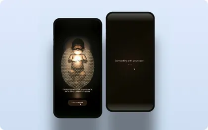
Bean is a sensor-based system that reads a premature infant's physiological signals, stress, dysregulation, the need for contact, and responds through a soft, adaptive swaddle. It gives parents and nurses a clear, real-time cue for when a baby needs to be held, instead of leaving that need invisible on a monitor built to track vitals alone.
Bean is a NICU co-regulation system I designed for the FigBuild Designathon. NICU babies often need touch exactly when no one is free to give it: parents cycle through limited visiting hours and postpartum exhaustion, nurses split their attention across several infants at once, and the baby has no way to signal what it needs in between. Bean makes that gap visible.
Design a speculative tool that tracks, measures, or influences a previously unmeasurable part of human sensory experience, in service of a real wellness goal.
Concept and interface direction went through several rounds before landing on the current version.


Coded as a particle system: moving the cursor in circular motions over the baby gradually builds the swaddle around them, standing in for the physical act of touch. It's a stand-in for the sensor data Bean would eventually read, and the fastest way to prototype what comfort building up should feel like before any hardware existed. Still an early pass, the timing and particle density need more tuning before it reads as touch rather than a loading state.


Status leads, the ask follows, the baby's current state shows first. Send Comfort only appears once a parent already knows nothing is urgent.
The comfort screen doesn't just end, "You were with them" reframes the session as something the parent gave, then hands off to View Journey.


Grouping by status, Caregiver connected vs. Resting between visits, lets a nurse triage four babies in one glance instead of opening four profiles. Recognition over recall: color and copy carry the priority, so "Needs attention" doesn't need a second read.
The resonance chart pairs two lines with a plain-language read: "Baby settling, gentle resonance with caregiver." A nurse splitting attention across several bays gets the takeaway without stopping to interpret the graph.


Click to stamp
Down the Rabbit-Hole
Alice was beginning to get very tired of sitting by her sister on the bank, and of having nothing to do: once or twice she had peeped into the book her sister was reading, but it had no pictures or conversations in it, “and what is the use of a book,” thought Alice, “without pictures or conversations?”
So she was considering in her own mind (as well as she could, for the hot day made her feel very sleepy and stupid), whether the pleasure of making a daisy-chain would be worth the trouble of getting up and picking the daisies, when suddenly a White Rabbit with pink eyes ran close by her.
There was nothing so very remarkable in that; nor did Alice think it so very much out of the way to hear the Rabbit say to itself, “Oh dear! Oh dear! I shall be late!” (when she thought it over afterwards, it occurred to her that she ought to have wondered at this, but at the time it all seemed quite natural); but when the Rabbit actually took a watch out of its waistcoat-pocket, and looked at it, and then hurried on, Alice started to her feet, for it flashed across her mind that she had never before seen a rabbit with either a waistcoat-pocket, or a watch to take out of it, and burning with curiosity, she ran across the field after it, and fortunately was just in time to see it pop down a large rabbit-hole under the hedge.
In another moment down went Alice after it, never once considering how in the world she was to get out again.

drag pieces to complete the puzzle
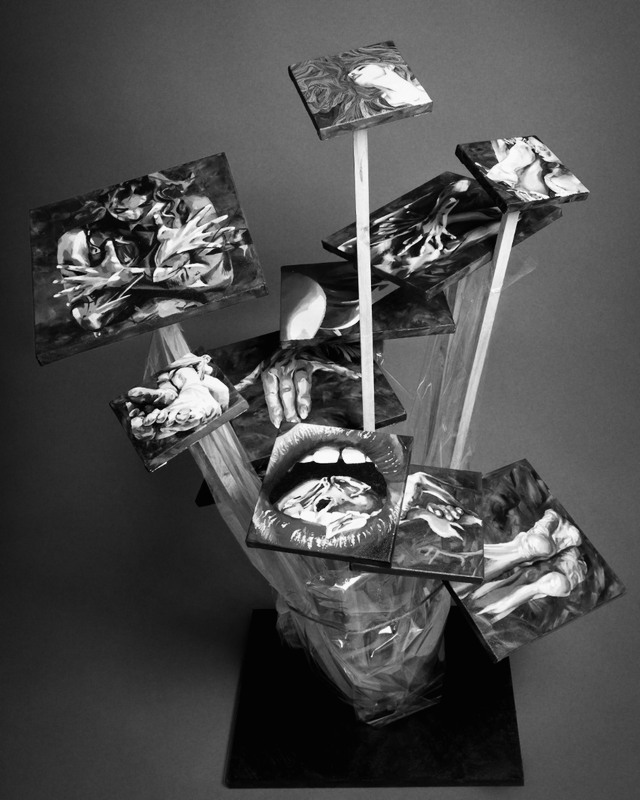
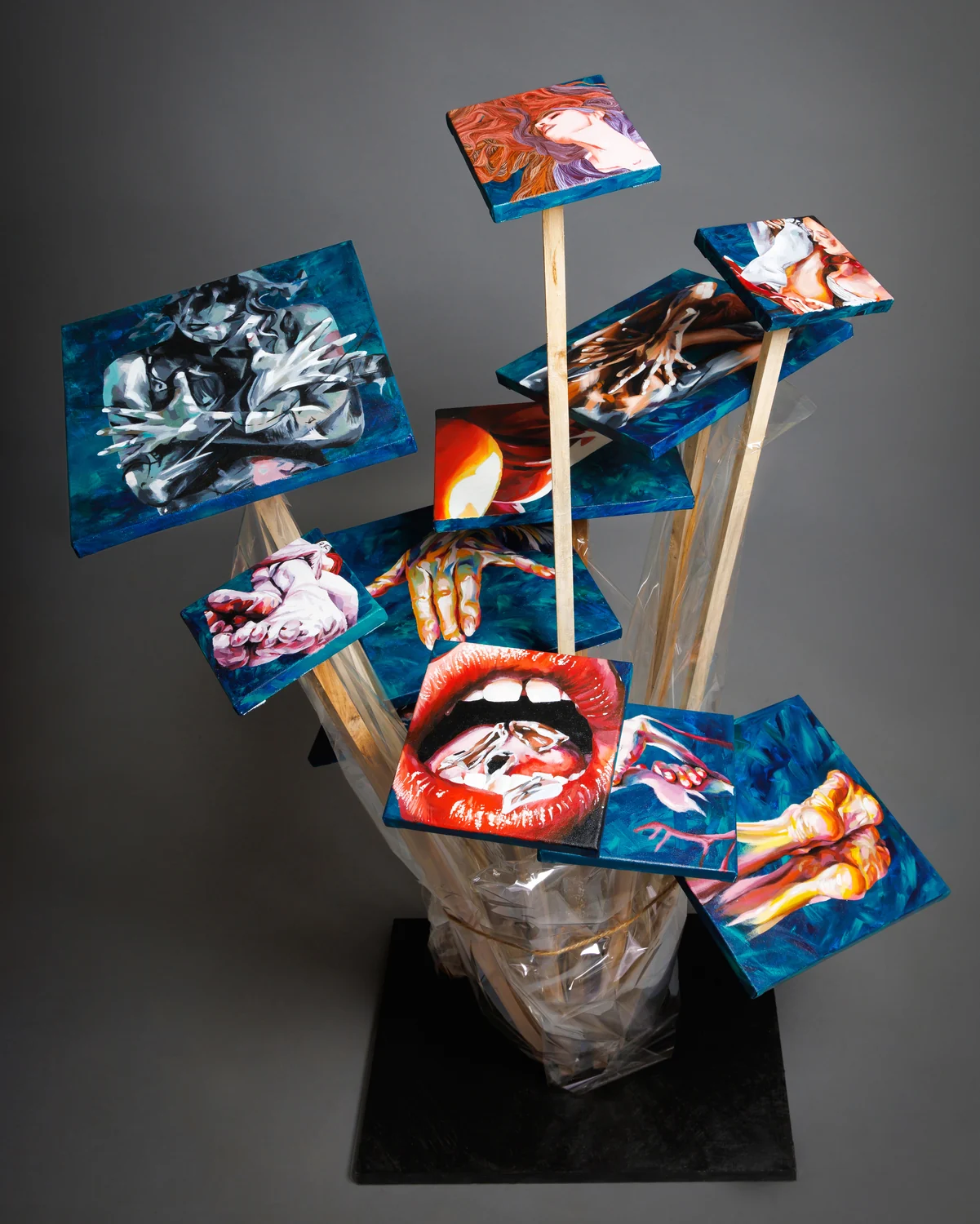
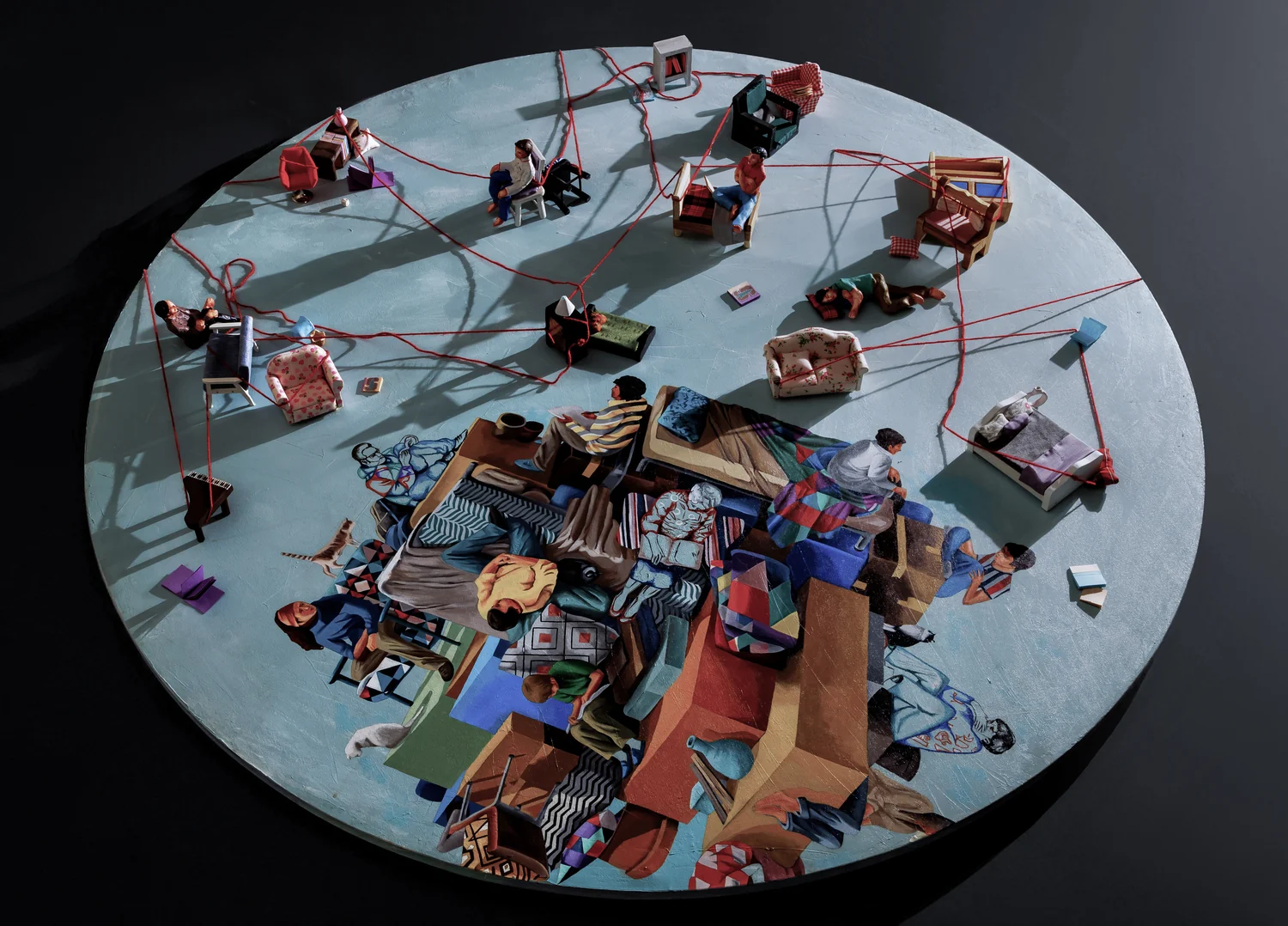
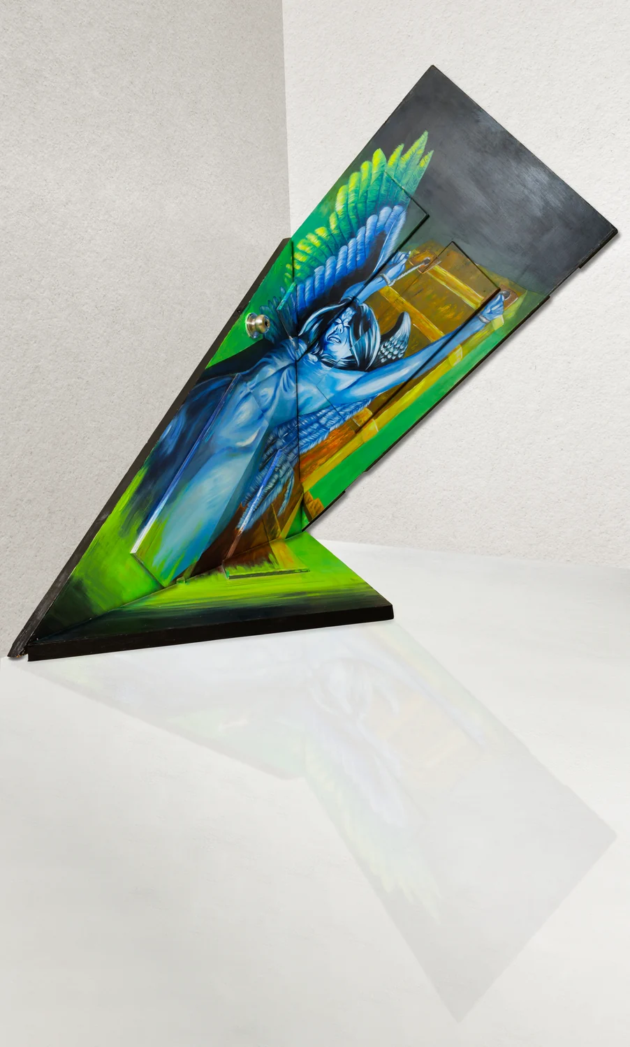
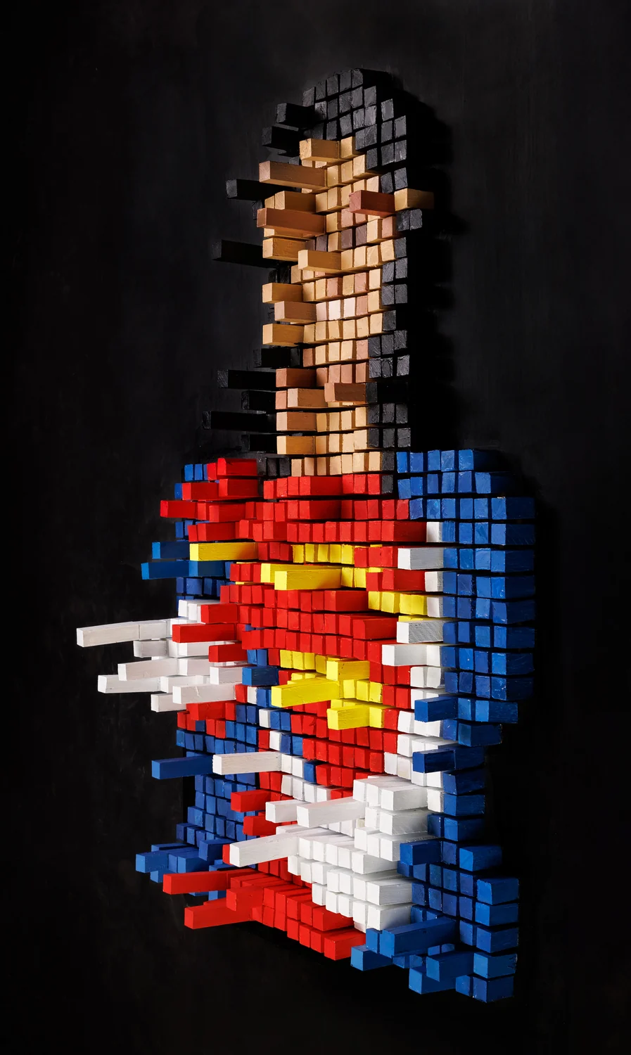
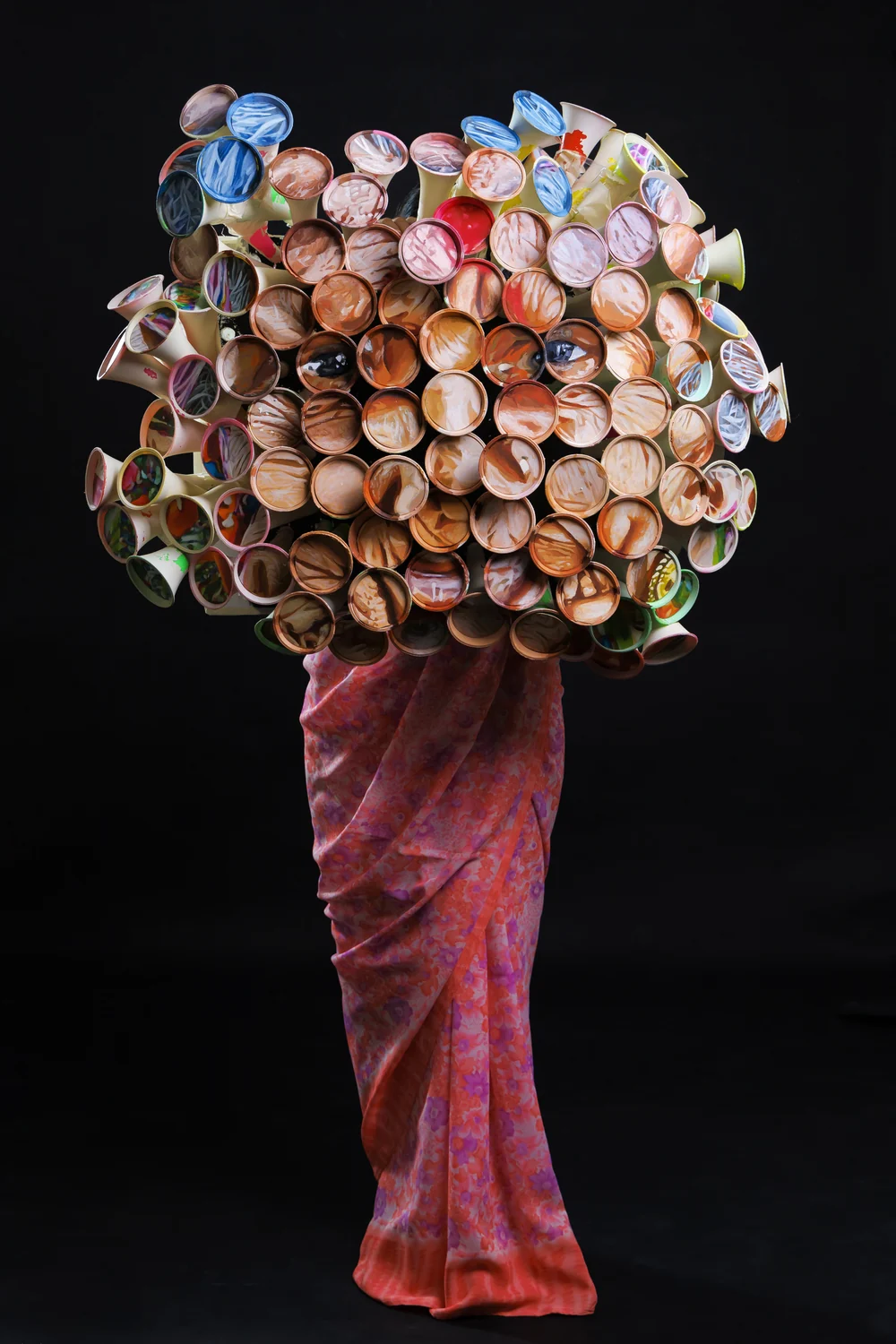

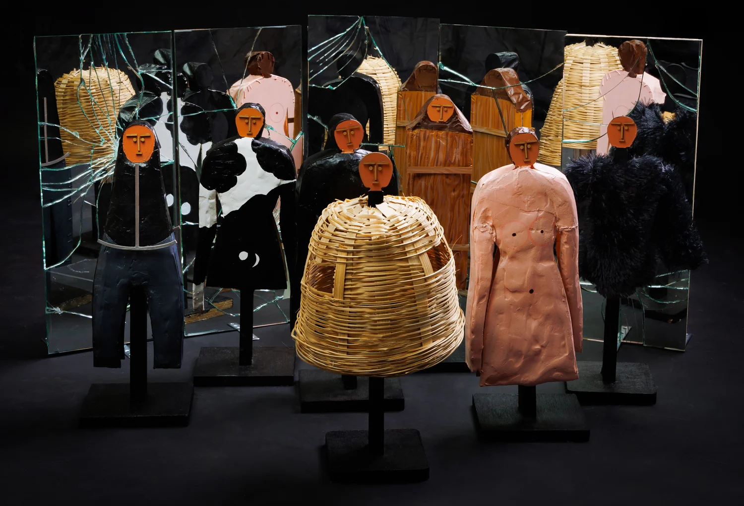
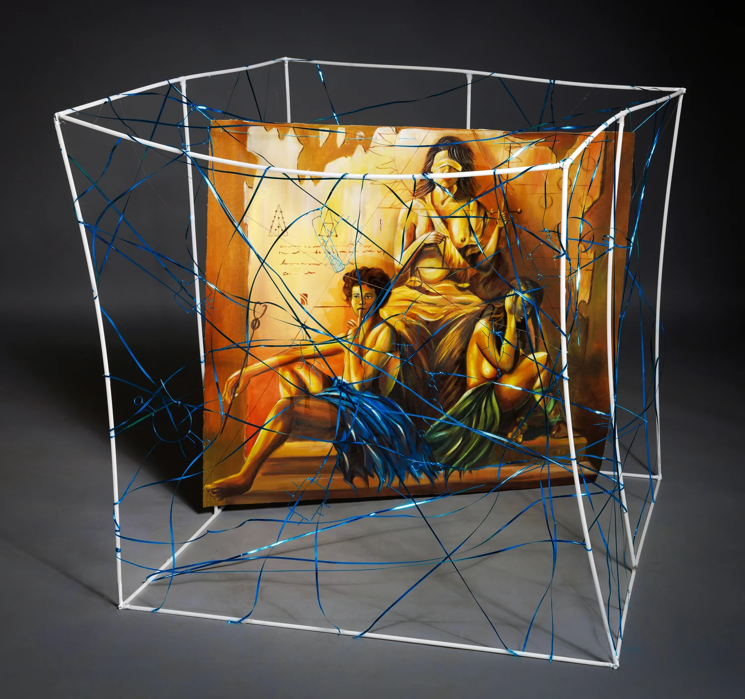
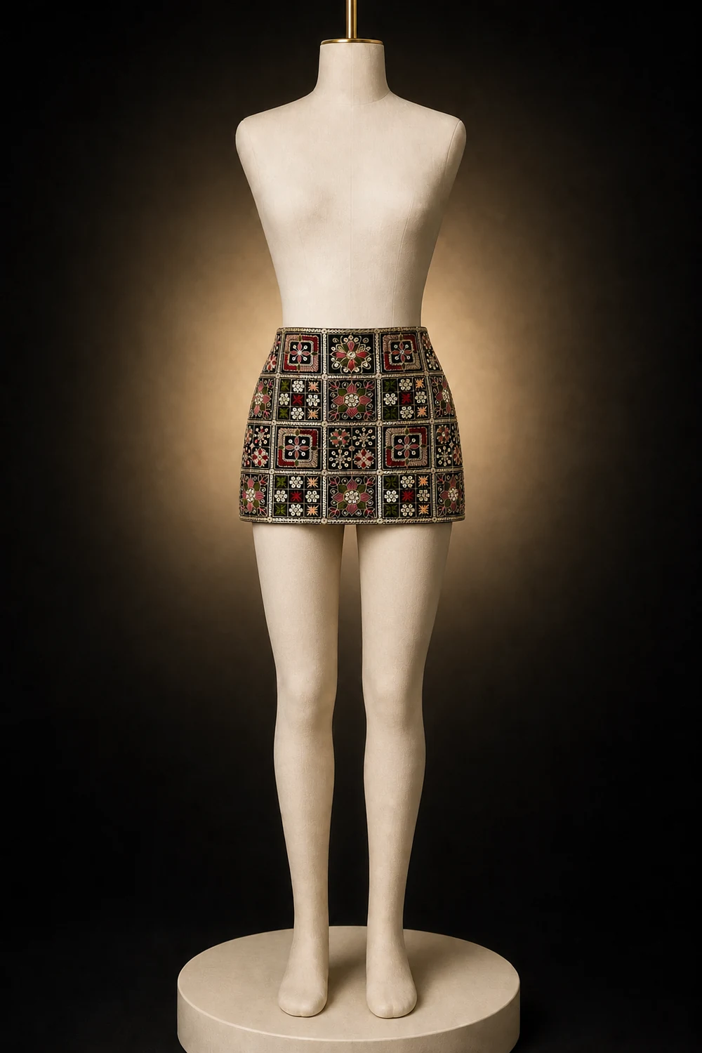
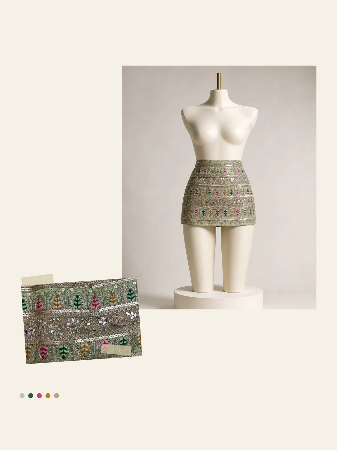
I keep taking the same idea into different materials to see what it survives.
Both pieces started with mirror-work and thread, the shisha and abhla bharat embroidery of Gujarat and Rajasthan, where tiny discs of glass are anchored with a ring of interlaced stitch so the surface catches light from every angle. The panels here are hand-worked: chain, satin and herringbone in floss silk, sequins laid one at a time along the grid, each square framed so the whole reads as a lattice rather than a scatter.
I cut them into a mini skirt on purpose. This work usually lives on a ghagra or a wall hanging, admired and kept for occasions; putting it on a silhouette this short is a way of arguing it belongs in a wardrobe, not a trunk. The dark ground and the sage colourway came from the two saris the fabric was cut from, and the mannequin studies let me see how the grid behaves on a body, where the pattern compresses at the hip, where the light breaks.