
Venetia
Bringing the runway to real-life
problem statement
Understanding Venetia
Competitive and User Research
UX Design and Experience Flow
UI Design
Despite the abundance of fashion platforms, there’s a gap in intelligent curation, real-time trend analysis, and a connected fashion community
Despite the abundance of fashion platforms, there’s a gap in intelligent curation, real-time trend analysis, and a connected fashion community
Specific UX-driven objectives prior to development:
Digital platforms have fundamentally reshaped the fashion industry, key revolutions include:
1. Data-Backed Personalization & Adaptive UX
Use real-time behavioral tracking to dynamically adjust content feeds and product recommendations.
AI-generated personalized trend forecasts & wardrobe suggestions based on past purchases and style preferences.
Predictive autofill & intent-based filtering
2. Social Layer & Community-Driven Features
Implement a live fashion forum for peer discussions, expert styling tips, and upvoted fashion opinions.
Trend validation through community engagement
3.High-Fidelity Interaction Design & Accessibility
Seamless microinteractions & animations that provide instant feedback for smoother navigation.
Gesture-based controls & fluid scrolling mechanics for mobile-optimized experiences.
With a UX strategy centered on hyper-personalization, AI-powered discovery, and interactive social engagement, Venetia is designed to be the ultimate smart fashion hub
Platforms leverage collaborative filtering, content-based recommendations, and deep learning models to offer tailored fashion suggestions. Personalized styling recommendations based on purchase history and browsing behavior
Community-driven shopping experiences with interactive discussions, real-time feedback, and crowd-sourced styling tips. Peer-to-peer resale and sustainability-driven initiatives to support circular fashion models.
Conversational chatbots for styling consultations and real-time Q&A. Gesture-based UI and micro-interactions for intuitive navigation.
AI-driven platforms analyze millions of social media signals (Instagram, Pinterest, TikTok) to detect emerging fashion trends before they go mainstream.
ML models trained on fashion week runways, historical sales data, and influencer behavior to predict demand shifts.
UX Strategy & Information Architecture
Act 1
Act 2
Act 3
Building a Smart Fashion Navigation System
Navigation Architecture:
Bottom Navigation Bar: Designed using Fitts’ Law, ensuring primary actions (Home, Trends, Community, Profile) are easily accessible with minimal effort.
Sticky Top Search & Filter Bar: Reduces cognitive load by always keeping the most relevant actions visible
Progressive Disclosure: Users are first introduced to broad categories, but as they engage, dynamic filteringpersonalizes their experience.
Act 2: UX Heuristics & The Five-Star Design Principles
Heuristic 1: Recognition Over Recall
Users don't need to remember categories; AI surfaces trending styles dynamically based on their behavior.
Heuristic 2: Visibility of System Status
Loading animations with fashion-inspired copy like "Finding your style…" provide user feedback & anticipation.
Micro-interactions on tap/swipe gestures enhance engagement, confirming seamless transitions.
Heuristic 3: Aesthetic & Minimalist Design
High-contrast, spacious layouts avoid information overload.
Heuristic 4: Consistency & Predictability
Every page follows a consistent grid layout, ensuring the user always knows where to find navigation elements.
Heuristic 5: Flexibility & Efficiency for Users
Users can customize their trend feeds for more relevant recommendations.
Design Thinking Principles
Empathize: Conducted user interviews & heatmap analysis to identify friction points in competitor apps.
Define: Users wanted a more engaging way to explore trends, rather than static product grids.
Ideate: Brainstormed ways to co-build recommendations with community discussions & trend forecasting.
Prototype: Created high-fidelity prototypes in Figma & Principle, simulating real-world interactions.
Test: A/B testing found that interactive carousels increased session time by 32% compared to static layouts.


Did you come to explore trends?
Go to "Trending"
Go to "Find It"
Jump into the "Community"
Looking for a specific piece?
Want to discuss fashion?
Assigned Functions


grid layout
loading bars

Ideation
Research
Prototype
Tools Used
Industry Benchmarking
Industry Benchmarking
Sample User Personas
Sample User Personas
Identified User Pain Points and UX changes
Information Architecture & Navigation
Core Structure
CoInteraction Design (IxD) & Visual Hierarchy
Behavioral Design & Retention Triggers
Design Layer
Atomic Design Framework
Grid and Spacing
Dark Mode Optimization
Motion & Interaction Design
Backgrounds are matte charcoal, not pure black, to reduce contrast fatigue
Pink, white, and soft grey act as high-contrast highlight colors
Product images auto-adjust with color-safe overlays to avoid washouts
Atoms
Molecules
Buttons
Type Scale
Icons
Info Labels
Trend Bubbles
Trend Feed
Discussion Threads
Discovery
Navigation Tools
Search engines
Color tokens
organisms
Templates
Pages
Strategy


Farfetch stands out for its clean user interface and strong emphasis on high-quality product visuals. It integrates editorial content seamlessly, offering users a blend of storytelling and shopping.
However, its UX heavily relies on basic filtering systems and lacks intelligent personalization, often making the discovery process feel manual rather than intuitive.
Strenghts
Friction Points
Moda Operandi shines in the luxury space by allowing users to pre-order items directly from runway collections. Its platform is anchored in storytelling, giving users an insider feel into designer narratives.
However, the navigation experience can feel clunky and outdated, and there's little to no social engagement features for modern shoppers.
Strenghts
Friction Points

Threads offers a unique concierge-style experience through chat-based personal styling, which creates a white-glove, curated vibe. Its editorial-led edits feel exclusive and personalized.
However, the model relies heavily on human stylists, which isn’t scalable and lacks the adaptability or intelligence of AI-powered systems.
Strenghts
Friction Points

While these platforms offer luxury, none have merged community, AI-driven recommendations, and interactive discovery in a mobile-native way. This gap inspired Venetia’s hybrid model.
Currently, users need to manually scroll and guess what might fit their style. Most services have static product list with basic filters like "Price Low to High" and "Newest First.
This makes the search mechanism more guided and helps the user clearly identify what they want
Venetia’s UX Fix:
UI: A dynamic “For You” section showing personalized looks.
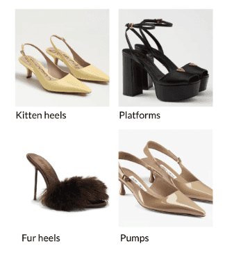
UX Pattern: Carousel cards labeled "Because you liked kitten heels" or "Trending in your city."
The Trendsetter
Demographics: Female, 22–30, fashion-forward, early adopter
Motivation: Wants to be first to wear new trends
Pain Points: Generic product feeds, slow trend visibility
Needs: Smart discovery, visual inspiration
The Informed Shopper
Demographics: All genders, 25–40, practical but style-conscious
Motivation: Buys based on validation (reviews, trends, stats)
Pain Points: Lacks peer-based insights, overwhelmed by choices
Needs: Trend analytics, stats-driven recommendations, social proof
The Social Fashion Enthusiast
Demographics: Female/non-binary, 16–27, social media native
Motivation: Loves styling, fashion talk, building personal brand
Pain Points: No space to interact or ask style questions
Needs: Fashion forums, styling polls, DM-enabled community features
1


There is an information Overload in Trend Analysis. Users bounce due to cognitive overload of endless text-heavy blog-style trend articles with no visual summaries.
This way, the information is categorized into a more concise, readable format. It immediately gives users an overview of the trend, keeping them engaged
Venetia’s UX Fix:
UI: Visual trend “bubbles” or heatmaps ranked by virality score.
UX Pattern: Immediate insight into what's hot, what’s fading.
2


There is a lack of an interactive fashion community. Mostly, the way people find trends is very metric driven (eg. based on how frequently others have bought something), but users also feel the need for an interactive community with qualitative insights and advice.
Venetia’s UX Fix:
UI: Dedicated Community tab with Reddit-style Q&A and upvotes.
UX Pattern: Anonymous posts, styling threads, DM feature for discussion.
3


A static product grid presents the same layout and items to all users, lacking any personalization or context. Discovery becomes repetitive, reducing user engagement and delight.
This adds visual contrast in the way products are presented throughout the app, while still keeping similar search styles consistent
Venetia’s UX Fix:
UI: Curated “Mood Boards” and discovery flows based on current vibe (e.g. Brunchcore, Power Play)
UX Pattern: Users discover by aesthetic, occasion (eg. Valentines), or social moment (eg. Runway show).
4


Principle: Hierarchical Progressive Disclosure
We designed Venetia to reveal complexity only when needed. Users are introduced to digestible content at the top layer, and can progressively explore deeper categories, collections, and insights.

Navigation Methodology:
Sticky bottom nav with intuitive icons
Microinteractions (bounce, glow, haptic) confirm action feedback
Accessible hierarchy — Home is visual-first, Collections is card-based, Community is text-first


Principle: Microinteraction Feedback Loops
Loading States |
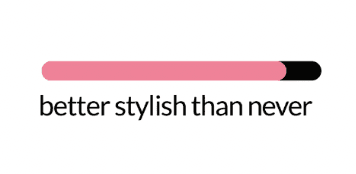
Fashion-themed copy with progress bars: "Finding your style…", "Better stylish than never…". Animated in pink and black for visual continuity.
Typography |
Headlines use oversized, fashion-mag style serif fonts. CTAs are minimal but high contrast for readability. Subtext uses light grey for hierarchy.
Card Design |
Dynamic, scalable product cards that adjust based on user behavior. Cards change in layout depending on “Why it’s shown to you.”
Carousel Structures |
Horizontally swipeable product cards with soft shadows, rounded corners, and “Saved” toggles. Optimized for thumb-friendly gestures.
Smart Segments
I want to make engagement Addictive, Not Just Functional. Using behavioral science and AI, Venetia builds habits around fashion discovery through subtle nudges and rewards.
AI segments users based on click-through, purchase history, and social following. These feed into custom feeds (“Your Trending Now”, “Inspired by your closet”).
Gamification
Users earn “Style Streaks,” “Trendsetter Badges,” and exclusive access by interacting
Psych Nudges
Subtle urgency triggers like: “Only 2 left in your size”, or “Trending with your followers.” Builds FOMO and drives micro-decisions.


8pt Spacing System
4-column mobile grid


Interaction
Motion Detail
Button Taps
Soft bounce with elastic-out easing
Trend Bubble Hover
Slight enlargement + glow effect based on virality score
Swipe-to-Discover
Spring animation with tactile haptics